These are some of the possible fonts that I am going to use on my front cover:
The font that I am going to use is the third one. I am going to use this font because it is bold and will stand out of the front compared to the other ones.
The first font is unique but is not very legible therefore I will not be using for my front cover.
The colour that I am using for my font is a dark blue, taken from the colour of the models shirt.
Thursday, 16 December 2010
Monday, 13 December 2010
Original Pictures
These are some of the images that I took for my magazine. I did not use these for my front page image as they do not have much space for the title to go. I like the lighting of the dark one as it is from beneath and highlights different parts of the face compared to the one on the right where there is lighting everywhere. I may use these pictures inside my magazine for the contents page to show what is going to be inside the magazine.
I like the image on the left as it is lit up and shows a slouchy posture which is a very popular pose in modern magazines. I like the background but it would be too bus for a front cover. The image to the right of that I like because of the angle, it is from above and shows the model giving direct contact to the camera creating realisation with the reader. The reason why I did not use this image for the front is because it is not as well focusses as the others.
The image on the right was not chosen for my main image because the lighting is very dark in it, I could adjust this but I want the picture to look as natural as possible. The pose that he is doing does not look as though it would appeal to people either, he looks very angry. The image on the left to that I like but there is not enough room above the picture to put a title. I do like the pose that he is doing in this picture as it is very innocent.
Target Audience
Genre - Rock
There is a lot of information on Rock Music from the this website. Rock is a popular genre that was at it's most popular in the 1960's. The Rock genre has evolved over time and can now has sub-genres of music types such as Emo. Rock music is usually produced by a band instead of a single artist as they use their own instruments to create the sound. Some of the main instruments used in a Rock band could be drums, bass guitar electric guitar, the majority of bands have these three instruments. Some of the earlier Rock bands could have included the Beatles, however, this is a very soft type of rock compared to Iron Maiden that are fairly heavy. Some of the more modern types of rock bands such as Bring Me The Horizon are very different to the old types of rock music in that Rock is more heavy now.
Thursday, 25 November 2010
Magazine Name Ideas
My target audience is males aged from 15-24. This is quite a young target audience so they will be easy to relate to. The genre of music I have decided to base my magazine on is Rock. I have chosen this genre because it is easy to identify compared to other genres such as Pop music.
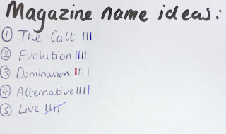
The names that I though of to call my magazine included "The Cult", "Evolution", "Domination", "Alternative" and "Live".
"Alternative" received the least amount of market research feedback. "Live" and "The Cult" received the most amount. I have decided to call my magazine "Live" as I feel this is the name that my target audience could relate to the most as the age that they are attend a lot of live gigs and bring back memories to them.
I asked 20 people in my target audience age group to complete a tally chart of my magazine name ideas, here are the results:
Magazine Conventions
MOJO and NME are similar to Cosmopolitan in may ways. They both contain a model/celebrity on the front, this is generally the main article and attracts a lot of attention. The image also overlaps over They both contain cover lines that include language devices such as quotes and repetition. They also have features that make particular sections stand out such as the yellow stamp on the front cover. All of the magazines contain a colour scheme, for cosmopolitan the colour scheme is black, blue, white and pink.
Some of the differences between celebrity gossip and lifestyle magazines with music magazines are the picture. The main image is very happy and bright in the cosmopolitan magazine whereas in the music magazines they are quite sophisticated and dark. The fonts for the magazines are very different also, in cosmopolitan the fonts are very feminine unlike the music magazines that include very straight writing which attracts a completely different target audience.
Wednesday, 24 November 2010
Magazine Analysis - MOJO (Inside)
In MOJO there are 146 pages in total, out of those pages 40 are used up by adverts. This is 28% of the magazine. Comparing this to other magazines that is only a small amount. The products advertised in the magazine could be classed into groups of: music related adverts and non-music related adverts. This shows that they do not get adverts from anyone but for ones that will interest their target audience such as gig guides.
The features of the magazine could be classed as:
Music related stories/reviews
- Pink Floyd - main article
- What goes on: New Lennon biopic approached
- Susanna and the magical orchestra portico quartet
- Rock 'n' Roll confidential: Steward Copeland
Lifestyle
- Albums
- Play list
- Books
Celebrity News/Gossip
- Hot news
- Hello Goodbye
- Theories, rants etc
- Ask Fred
The magazine manages to use a unified "house style" throughout by using the same sans serif font in all the articles. This gives the magazine a sense of stability and shows some routine throughout. The magazine also contains text in the top left corner in the same style at the beginning of each section, this also adds to the house style.
Magazine Analysis - MOJO (Cover 4)
All of the fonts on the cover of MOJO are a sans serif font. This takes away the formality of the magazine and makes it look more approachable and young. They use the colours black, grey, white and red. These are very basic colour but work together making the red and white writing stand out. They use a small drop shadow on a lot of the cover lines making them stand out of the page but not making it look too busy. The title of the magazine is the only part that does not contain a drop shadow which is ironic as this is the part that you would think would stand out the most. To make specific features stand out they have used red boxes behind some of the writing, this follows the colour theme but also makes them attractive to the reader.
On the front page they use some language devices. Some of these include a rhetorical question which makes the reader want to look inside and find out about the "joke" that has been asked. They also use a quote, this attracts the target audience as it is usually the best part of an interview making the reader want to read more of the interview.
This cover is distinctive from others as it sticks to very little change of fonts which often might not work but in this particular magazine it does. The USP (unique selling point) of MOJO could be their distinctive style of music that not many other magazines produce.
Magazine Analysis - MOJO (Cover 3)
The only other image that appears on the front cover of MOJO is an image placed on the top right corner of the magazine. This image does not affect the rest of the magazine or take the focus away from the main article. The picture is at an angle making it look like more of a collage than a magazine which does not follow the style of the magazine as they generally have photographs lined up. Again the picture is of a male to attract the specified target audience.
The cover lines of the magazine are very busy and promote a lot of what is inside. Some of them contain the main articles in the magazine - such as "U2 in the US", "Kiss "We're like the Beatles on steroids"". These groups and bands are from the ear of music that the magazine approaches. This is what the target audience wants to read about and so they are placed on the front cover to make people want to buy the magazine.
Magazine Analysis - MOJO (Cover 2)
The main image of the magazine is Pink Floyd, it is a medium shot (from the waist up). The pose of the artist is very serious. He is looking into the camera face on. He somehow looks angry by the way he is holding himself, with his arms crossed and very tense. He is wearing a black top which contrasts with the light grey background making him stand out. The image is not very busy but yet very simple and shows that music is the sole purpose of this particular magazine. This image would appeal to the taregt audience as he is around the same age and is male, this means that the audience may be able to relate with the articles in the magazine.
Tuesday, 23 November 2010
Magazine Analysis - MOJO (Cover)
This is the only section of the title that is on show on the front cover of MOJO. The title is in a bold black font which stands out on the light grey background. The main image is covering over the title, this shows that the magazine is confident people do not need to see the whole name of their magazine to understand the purpose. The word "mojo" could be replaced for the word confidence which suits the magazine as they are confident about the success and music they produce. The title of the magazine is in a sans serif font and is very basic. The strapline of the magazine says "music magazine" this is very simple and gets the message across that the magazine is there for music as that is not clear from the title.
Magazine Analysis - MOJO (General 2)
The National Readership Survery shows that in July 09 - June 10 there was an average of 218,000 people buying MOJO each month. It showed that 143,000 people were in the ABC1 class and 75,000 were in the C2DE class. 157,000 of the people were aged 15-44 and 61,000 were 45+. This is unusual as the target audience for the magazine is quite old so you would think that there would be more people in the 45+ category. However, there were 169,000 males that bought the magazine and only 49,000 females, this follows the trend of the target audience.
Magazine Analysis - MOJO (General)
The company that produces MOJO is Bauer. They only began published MOJO in January 2008, before Bauer, MOJO was published by Emap. This company also publishes Bella, Take a Break and Total TV guide. These magazines are fairly popular but are generally aimed at women. The target audience of MOJO is males aged 30+, this is shown through the music genre of the magazine as younger people would not be as interested in "classic rock". The magazine is published monthly and costs £4.50 to buy, this is quite expensive but the magazine sometimes contains a free CD or gift. The circulation of the magazine 91,678 and the readership is 106,367.
Monday, 22 November 2010
Magazine Analysis - NME (Inside)
NME contains 67 pages in total. Out of these pages 19 are used for adverts, this is 28.4% of the total magazine. This is not a lot compared to a lot of magazines as this is how the companies earn their money. The adverts in the magazine could be put into groups such as clothes and accessories, gigs and shows and electronic accessories. The adverts in the magazine would definitely appeal to the target audience. The features in the magazine include:
Reviews on gigs/festivals
- Babyshambles review
- NME tour 2011 line up revealed
- Rihanna
- Twin Shadow
- Tinchy Stryder
- Foals
- Manic Street Preachers
- Release the bats
- Tame Impala
Interviews with people
- Damon Albarn interview
- Chester Bennington
- My Chemical Romance
- Suede comeback interview
- Jenny and Johnny
- These New Puritans
- Mick Rock
- Alice Cooper
Gig Guide
Fanmail
There are 11 double page spreads in this NME magazine. The majority of them are main interviews with people throughout the magazine. The main article in the one that was advertised on the front cover which takes up two double pages.
NME has a unified "house style" which is consistent thoughout the magazine. It uses the same sort of fonts throughout the pages. The maority of the magazine also has a white background with black writing in a serif font (for interviews), this helps to identify the magazine. In NME the layout of pictures are fairy similiar, they lay them on the page like a collage instead of a normal and conventional way. They are sometime overlapping each other or tilted at an angle. NME also uses a lot of quotes in the magazine, they will usually use the subtitle of an article as a quote. This gets the readers attention as it is usually an interesting statement made by the interviewee. The "house style" would apply to the target audience as they are fairly young and the magazine has "fun" aspects to it that would not appeal to an older audience.
Sunday, 21 November 2010
Magazine Analysis - NME (Cover 4)
These are the cover lines on the front cover of NME. Cover lines show some of the different stories/articles that will be inside the magazine. The cover lines for this magazine shows the line up for the NME tour in 2011 and a comeback interview with an old band. The name of the band is in bold to make it stand out of the page to the audience. The other cover lines showing the line up for the NME tour does not stand out as much as it is white on a pale blue background. However, this coverline will attract a lot of attention as they are hosting a tour with a lot of famous people in all different genres of music meaning some people who do not normally buy the magazine, may buy it.
The font cover of NME is all in a sans serif font, excluding the writing "New Musical Express". It is also all in capital letters, this emphasises everything making it all seem very important. The font produces a non-formal image and appeals to a younger audience. The title of NME is placed infront of the main image whereas in most magazines the main image would be infront. The words "my chemical romance" contains a drop shadow around it to make it stand out from the page on the dark background of the singer's top. The main colours on the front page are red, white, blue and black. The red and black work together as if to show danger whereas the pale blue and white work together to show purity.
The language features used on the front page are the use of a quote from the main interview, this entices the reader as they now want to read more. The cover also contains adjectives such as "amazing". They also use a pun with the word red. The article is obviously displaying the singers new image (his red hair) and beneath the main image says "Gerard sees red". This could mean he is literally seeing red (his hair) or that he is angry about something. This would engage the reader as they want to know why he is angry.
The other two magazines that I am comparing NME with are Q and Kerrang. NME has lot brighter colours than these other two magazines. Q is a very plain front cover with very little cover lines whereas Kerrang is a very busy front cover. NME seems to be in the middle of the two covers when it comes to the amount of cover lines. Looking at fonts, Q has a variety of serif and sans serif aswell as Kerrang. This shows that they have a versatile audience that appeals to different ages. Kerrang and Q seem to enhance their titles more than NME, for example Q has a bright red background behind the name to make it really stand out on the page. I think that NMEs unique selling point (USP) is that it looks more friendly with it's variety of colours than the other two magazines as they have very dull colours in the magazines.
Magazine Analysis - NME (Cover 3)
There are only three other images on the front page (not including the main image). They are located to the left of the magazine and are pictures of the free posters included inside. They are on the cover to attract attention and as they are classed as "free" this makes people think that they are getting more for their money. It also shows that the magazine has more to offer than just the main image and that if the main article does not appeal to someone then they may like the others inside.
Magazine Analysis - NME (Cover 2)
This is the main image for the NME magazine's front cover. The image is of the main singer from a popular band called My Chemical Romance. One reason that they are doing an article on him is because of his recent image change from black to red hair. In the image his pose looks quite feminine, the way that he is holding his hair looks quite graceful. His gaze is aimed to look straight through the camera almost making eye contact with the audience. This creates almost a relationship between the reader and the singer. In the photograph the singer is tilting his head forward in a way that almost innocent as he is looking up into the camera. The singer is wearing all black, this makes his hair stand out even more. From looking at the main image the genre looks goth as the singer is wearing all black but as the background of the image is a light blue this balances the genre out and it does not look quite as Gothic. This image would attract NME's target audience as it is a male singer on the front and the magazine is aimed at males. This means that they would be able to relate to each other as he is also around the same age of the target audience. Generally, males listen to music by other males making the chance of the target audience buying this magazine greater.
Friday, 19 November 2010
Magazine Analysis - NME (Cover)
The title of the magazine is NME. This stands for New Musical Express which was the title when the magazine was formally a newspaper. They still add the New Musical Express title but use if as a logo/strapline therefore it is a lot smaller than the main NME title. The title is in block capitals and in white which makes them stand out against the pale blue and red of the man's hair. The white colour gives an image of purity and innocence however, this is ironic as the main article in the magazine is about how the singer has changed his hair to red showing danger.
Magazine Analysis - NME (General)
The company IPC media produce the magazine NME, they also produce two very popular woman’s magazines named “Look” and “Marie Claire”. Overall they produce 85 iconic media brands. I found this information on their website. The target audience of NME are males aged 17-30. This is shown throughout the magazine as the adverts are also aimed at this category. Some of the adverts that the magazine contains are men’s clothing and accessories. The magazine costs £2.30 to buy and is published weekly. The total circulation of the magazine is 33,875 (January – June 2010). The readership of the magazine is 325,000.
Magazine Analysis - NME (General 2)
The national readership survey from July 2009 to June 2010 states that 325,000 people read the magazine weekly; this is 0.7% of the total population. 218,000 of these people are from a “white collar” social class such as doctors and teachers. 107,000 people that read NME are from a “blue collar” social class. They would have professions such as a builder or mechanic. 294,000 of the readers are aged 15-44 this is 90.5% of the total readership of NME. Only 31,000 are aged 45+. 241,000 males read the magazine this 74.2% of the readership of NME. Only 84,000 females read the magazine each week.
Wednesday, 17 November 2010
Final Contents Page
I added in the last bit of text to my contents page and spread it out. This made it look fuller and clearer for the audience to find the section they want easier. I also added a star to my contents page to the "stars in their eyes" section. This made the page look full and added something a bit more interesting to the contents page. I made the main article "here come the girls" bolder so it stands out from the rest and also links to my front page.
Thursday, 11 November 2010
First Stage of Contents Page
To begin with my contents page I added a black background, this is because it is a colour that would not clash with anything else. I then used the same font as my front page for the title and the same colour also to show a consistent theme within my magazine. I also placed the school logo in the contents page, this also follows the theme through from the front cover. I placed a blue and yellow rectangle onto the contents page which resemble the school colours. For the information on the contents page I used the same font as I used for the coverlines on the front cover, this also portrays a theme in the magazine. I then edited two pictures and placed them onto the contents page.
Sunday, 7 November 2010
Final Design
This is my final piece for my Preliminary Task. I have added a lot more cover lines to my design to make it look very eye catching and interesting. I used the font for my cover lines. This is a serif font and gave the magazine a more proffessional look. I stuck to the colour blue and yellow to match the school badge. I used more yellow than blue in the front cover as it was the November edition so I linked in the colour with the autumn season. As I edited the lighting and contrasting of the picture the writing did not come out very clear in some of the colours. I resulted in putting a shape behind the writing to make it stand out and to make it easier to read. I changed the transparency of the shapes as when they had 100% opacity it was very bold and took the attention away from the main article. I included another picture to the front cover of my magazine to match one of the articles.
Thursday, 4 November 2010
First Stage of Front Cover
To begin I edited my picture by adjusting the contrast and brightness to make the picture look sharper. I then added a title name "Wilmo News" in a font named "Allstar". I took the yellow out from the badge of the Wilmington Grammar for Boys logo and used it for the colour in my title. I then added a cover line for my main article. I decided to name it "here come the girls" as the article is going to be about the first year the school has had girls in the sixth form.
Thursday, 14 October 2010
Preliminary Exercise
Preliminary exercise: using DTP and an image manipulation program, produce the front page of a new school/college magazine, featuring a photograph of a student in medium close-up plus some appropriately laid-out text and a masthead. Additionally you must produce a mock-up of the layout of the contents page to demonstrate your grasp of DTP.
Thursday, 23 September 2010
Subscribe to:
Posts (Atom)